Groove Theory #16 - The Beautiful Map Nobody Wanted
Not yet a subscriber? Sign up. Or explore the Groove Theory archive →
I'm your host, Howard Gray, founder of Wavetable - the experiential education studio.
Currently: watching the year wind down from Brooklyn, going positively bananas with Claude Code
When I lived in NYC's East Village, I walked past Cooper Union a hundred times without understanding what happened there. I'd be heading downtown - NoHo, the Lower East Side, my boxing gym on Broadway - and there it was, this brownstone building I knew had a history, but never thought deeply about.
Cooper Union's Great Hall is where Lincoln delivered the speech that made him president. Where Frederick Douglass spoke. Where the NAACP was founded. For over 160 years, it's been the place New Yorkers go to argue about things that matter.
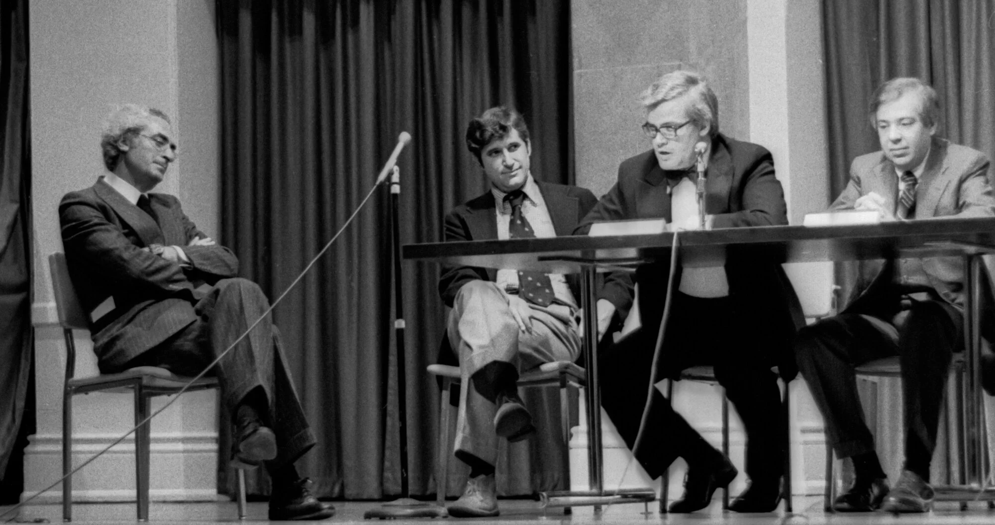
As New Yorkers love to argue about things that matter, it's where two designers nearly came to blows... over a subway map.
On April 20, 1978, Massimo Vignelli and John Tauranac faced off for over two hours. Designers, transit officials, and disgruntled riders packed the room. Insults flew. Vignelli later thanked the moderator for helping him suppress his "homicidal urges." Tauranac won.

A year later, Vignelli's map design was scrapped. The design world mourned. New Yorkers breathed relief.
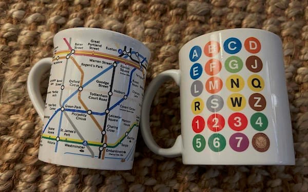
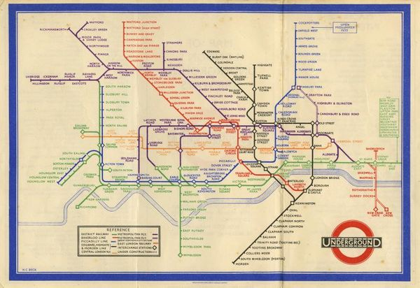
I should confess: I'm a transit nerd. A citizen of two cities - London and New York - with mugs from both systems that I use almost daily. A framed abstract NYC subway map hangs on my wall, a recent and cherished gift. I remember a childhood trip to the London Transport Museum, staring at Harry Beck's Tube map, those clean colourful lines that promised you could get from anywhere to anywhere. And I remember my first descent into the New York subway on a boiling hot June morning in the the early 2000s - falling for the city through the Helvetica on its signs. That was Vignelli too, along with Bob Noorda.

This past April - forty-six years after Cooper Union - the MTA unveiled their first major map redesign since 1979.
It looks an awful lot like Vignelli's.
The Tension
In 1972, Vignelli's map appeared on subway station walls. Clean geometry, bold colours, every line bent at 45 or 90 degrees. Stations were evenly spaced dots. The messy city above vanished into abstraction.

"If you can design one thing, you can design everything," Vignelli believed. He'd done American Airlines, IBM, the Washington Metro. The man could systematise anything.
The only issue? New Yorkers hated it.
Central Park became a square. The beige ocean looked nothing like water. Stations floated in strange positions, divorced from the streets above. Tourists emerged to find landmarks nowhere near where the map suggested. People couldn't relate the map to the city they knew.
Vignelli's response? The problem "lies not with the map, but with the map users."
Step Into It
We've all been Vignelli of '72. We’ve built the wonderfully elegant version. And we’ve watched it meet the room. Wondered why people wanted all the mess back.
The uncomfortable question: were they wrong… or were we?
The Groove: Structure
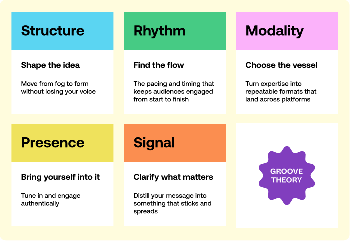
Structure → Shape the idea. Move from fog to form without losing your voice.
Vignelli wasn't wrong about the design. But he was wrong about the context.
Harry Beck had created a nearly identical abstraction for London's Underground in 1933. Same principles - geometric lines, topology over topography. Londoners loved it. It became arguably the most successful cartographic design ever made.

So why did Beck's map succeed while Vignelli's failed?
Having spent (too much) time with both, I think it comes down to this:
London's medieval streets are chaos. The city sprawls in every direction without logic. Beck's abstraction imposed order on disorder - a gift to anyone trying to make sense of the place.
Manhattan sits on a precise grid. New Yorkers navigate by numbered streets and avenues. They know exactly how long it takes to walk from 14th to 27th. When Vignelli's map distorted those distances, it didn't clarify - it contradicted something they already held in their heads.
Same structure. Different cities. Opposite results.
There's another wrinkle. Vignelli had conceived four complementary maps - a diagram, a geographic map, a neighborhood map, and an index. Budget constraints meant only the diagram got produced. Ripped from that context, it was always doomed to fail.
1. Your context changes what structure works
The same principles that clarified London's chaos violated New York's grid. Before you commit to a structure, understand what your audience already holds in their heads.
2. Systems need all their parts
Vignelli designed four maps that would work together. He got funding for one. The diagram was never meant to stand alone - it was meant to handle navigation underground while other maps handled the surface. When you're designing interconnected pieces, losing one can break the logic of the whole. And always be ready for the budget to get pulled.
3. The users aren't wrong for being users
Vignelli blamed map readers for not understanding his map. But a map exists to serve travelers, not the other way around. When your structure requires the audience to change how they think, you've stopped solving their problem and started solving your own. Oh my, how easy a trap this is to fall into.

Structure is one of the five elements of Groove Theory. Learn more →
The Release
The 2025 MTA map looks like vindication. Fifty-plus years later, Vignelli won.

But look closer. Water is blue now, not beige. Central Park's shape is (a bit) closer to reality. And crucially - smartphones handle street-level navigation. The map no longer needs to do everything.
What changed wasn't the design principles. What changed was the world around them.
Vignelli died in 2014, never seeing his approach return. But he got one more chance. In 2011, the MTA invited him back to design "The Weekender" - a digital map for weekend service changes. He agreed on one condition: it had to be called a diagram, not a map.
He wasn't making the same mistake twice.

The map was a rare miss in a staggering body of work. Vignelli brought the same rigour to American Airlines, Knoll, Bloomingdale's, the National Parks Service, Sotheby's. The man could design anything.
But even Vignelli learned you have to meet the city - and its people - where they are.
Howard
Extended Mix
- The 1978 debate was lost to history - until 2021. A reel-to-reel tape was discovered in Cooper Union's basement containing the full two-hour recording. Filmmaker Gary Hustwit published a book with the complete transcript, never-before-seen photos, and new interviews with surviving participants.
- Want to go deeper on Vignelli? This interview is one of the best I've found - covering everything from how he smuggled Helvetica into Italy to his thoughts on design education.
- Beck's map was rejected too, at first. The London Underground's Publicity Office initially turned down his 1931 design as "too revolutionary." A year later, after revisions, they printed 750,000 copies. Within months, it was a massive success. Sometimes "too radical" means "not yet."
- The original map cost $105,000 to produce in 1972 - about $775,000 in today's dollars. It was unveiled at a ceremony in the station at 57th Street and Sixth Avenue, with a companion subway directory showing how to get to every other station alphabetically.
Member discussion